This is a quick draft of one of my preferred ideas. Its changed a fair bit since the initial idea, but the essence of the original thought still remains. It is a little early to commit to an idea, which is why I wish to make it clear that this is by no means a final screenplay. I simply wanted to elaborate upon the original idea in a way that described exactly what I am visualising for this idea.
Patchwork Pals- Version One
Tuesday, 31 January 2012
Nicholas Provost's 'Stardust'
Whilst in London last year I visited an exhibition of the work of Nicholas Provost at the Haunch of Venison. The work there included his short film Stardust, a film consisting of candid footage of random inhabitants of Las Vegas, including unscripted, natural footage of celebrities such as Dennis Hopper, Jack Nicholson and Danny Trejo. The footage was then specifically cut together and dubbed over with a totally unrelated soundtrack and voiceover, to provide the footage with a crime-thriller story that was never originally there. It goes to show that the editing can make or break the final result of a film.
"This time Provost takes his hidden camera to Las Vegas in 'Stardust' and uses the glorious and ambiguous power of the gambling capital to turn everyday life into an exciting crime story. In order to do this he even filmed real Hollywood stars such as Jon Voight, Dennis Hopper and Jack Nicholson."
Below is a short preview of Stardust (I can't find the full length version.)
The Haunch of Venison summary of the exhibition here.
Provost's site here.
Monday, 30 January 2012
Unit Four: Storytelling
And so it begins!
The components I selected are:
'Frankenstein' Revisited Idea
'Patchwork Pals' Idea
The components I selected are:
Environment- Pet Shop
Prop- Umbrella
Character- Frankenstein's Monster
I've had some very simple thoughts and ideas surrounding potential scenarios once I received the components, these include:
'Frankenstein' Revisited Idea
-An eccentric pet shop owner with a taste for science fiction attempts to recreate the premise of his favourite story, Mary Shelley's Frankenstein, by constructing a creature of his own. The lack of human components leads the owner to construct the creature from bits and pieces of his own furry friends. A harrowing storm shakes the shop during the final stages of the twisted re-birth, resulting in copious amounts of water trickling through the building, and onto the various elements of the precious contraption. In order to prevent a drastic catastrophe, the owner frantically places umbrellas all over the shop, shielding his devices from the rainwater.
'Patchwork Pals' Idea
-An up and coming scientist wishes to embark on a journey to become the most dastardly evil genius the world has ever seen. Although, this cannot be achieved without the scientist first employing the services of a submissive minion. In order to do so, the scientist visits a store that specialises in selling just the thing; its somewhat of a pet store, dabbling specifically in monsters and henchmen. After all, in the eyes of an evil genius, these people are no more than pets, really. The store is fully stocked with the latest in monster and henchmen technology, but what the scientist really wants is something a little more... retro. Delving into the bargain basement (quite literally, a basement), he discovers a patchwork creature, manufactured by none other than Dr. Frankenstein himself! The scientist quickly snatches up this once in a lifetime bargain, only to discover the reason why the creature is going for such a low price. He's missing an arm. Typical. Unable to tear himself away from the retro charm of the creature, he establishes an alternative solution, equipping the creature with a brand new limb, fashioned from an old umbrella. The scientist finalises his purchase, and he and the creature make their way back to the scientist's laboratory, using the creature's newly installed limb to protect them from the elements on their way.
'Cat Thumbs' Idea
-A, somewhat slow, inventor attempts to patent a design for a brand new umbrella, exclusively for cats. The inventor recieves a rejction from the patent office, being told that his design simply will not function thanks to the lack of thumbs the average cat possesses. Furious that his idea has been rejected, he takes matters into his own hands, obtaining in a plethora of different cats from the local pet shop. In the evening, the inventor begins to create his own enhanced felines, grafting human thumbs onto the paws of the animals in order to make his invention actually useful. Of course, the patent office will be the last of his troubles when the RSPCA catches onto his devious plan.
Thursday, 19 January 2012
Concept Painting
This is my completed concept painting for my scene.
 My concept painting does not feature all of the elements that are present in my final image, as well as some prop designs that were revised (such as the maitre'd stand in the foreground and the door on the far wall) and the painting was created before my matte painting revision (as mentioned in a previous post) was integrated. Either way, I still followed this religiously to get the setting correct, and as a concept it still follows pretty closely to my final scene.

Final Scene with Matte Painting
This is my final scene, with the matte painting integrated.
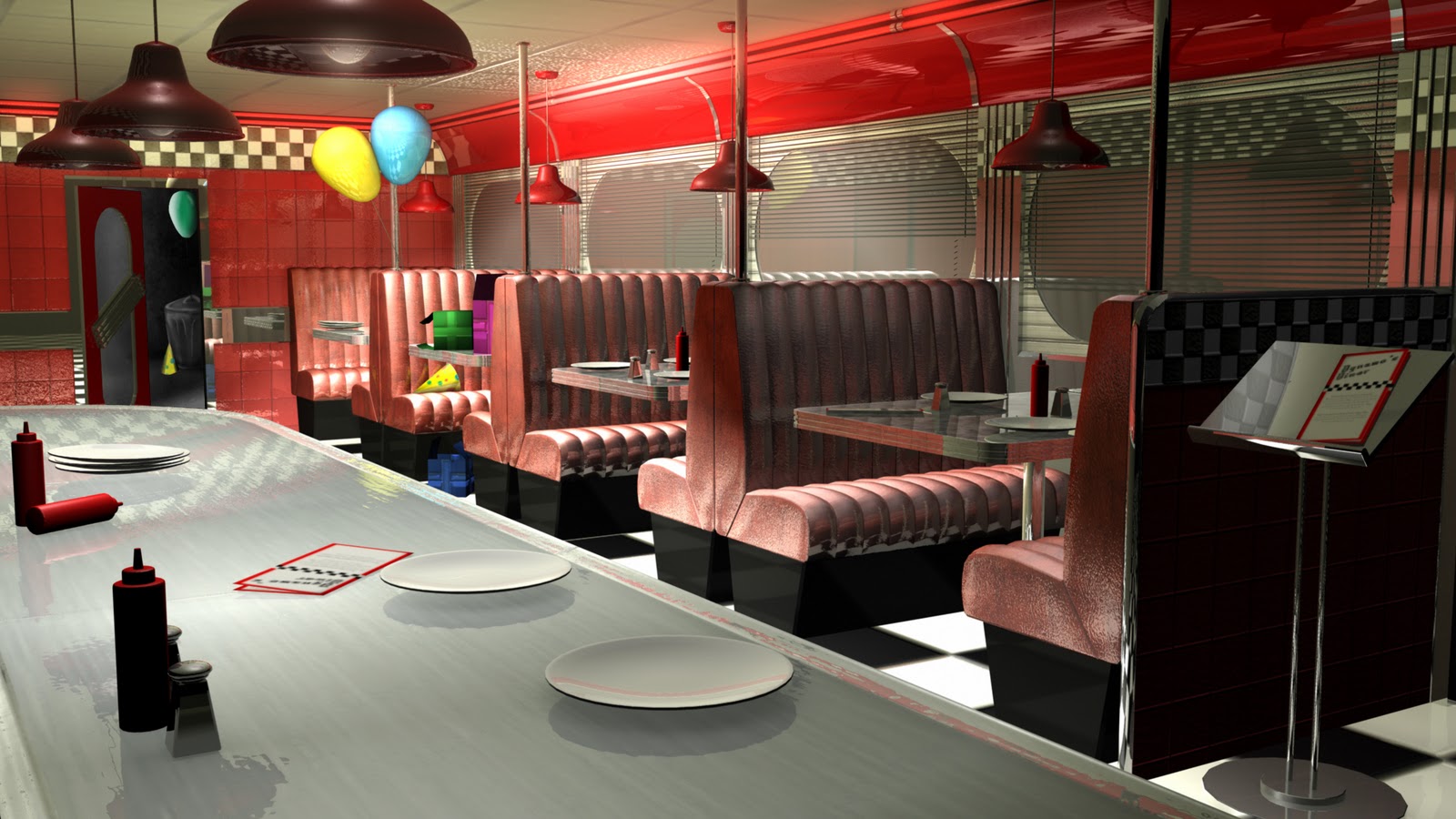
The matte painting has also been integrated in the doorway. The door leads out onto an alleyway, as opposed to the car park idea which I had previously dabbled with. Originally, the matte painting was going to be placed behind the windows, but as I wished to retain the reflectivity in the scene, I chose to keep the windows in place. After researching it (and even testing it out using my bedroom window), I came to the conclusion that with such a high level of reflectivity and the night time setting, realistically you wouldn't see a street, clear as day, through the windows.I reinvented the matte painting and personally, I prefer the alley idea considerably more than the previous street idea as it fits the scene in a more unique way than simply adding in the most expected idea.

The Matte Painting
Overall, I'm quite happy with my final scene. I feel quite a sense of achievement considering I've never done anything on quite this scale with Maya before, and its turned out pretty positively.
Wednesday, 18 January 2012


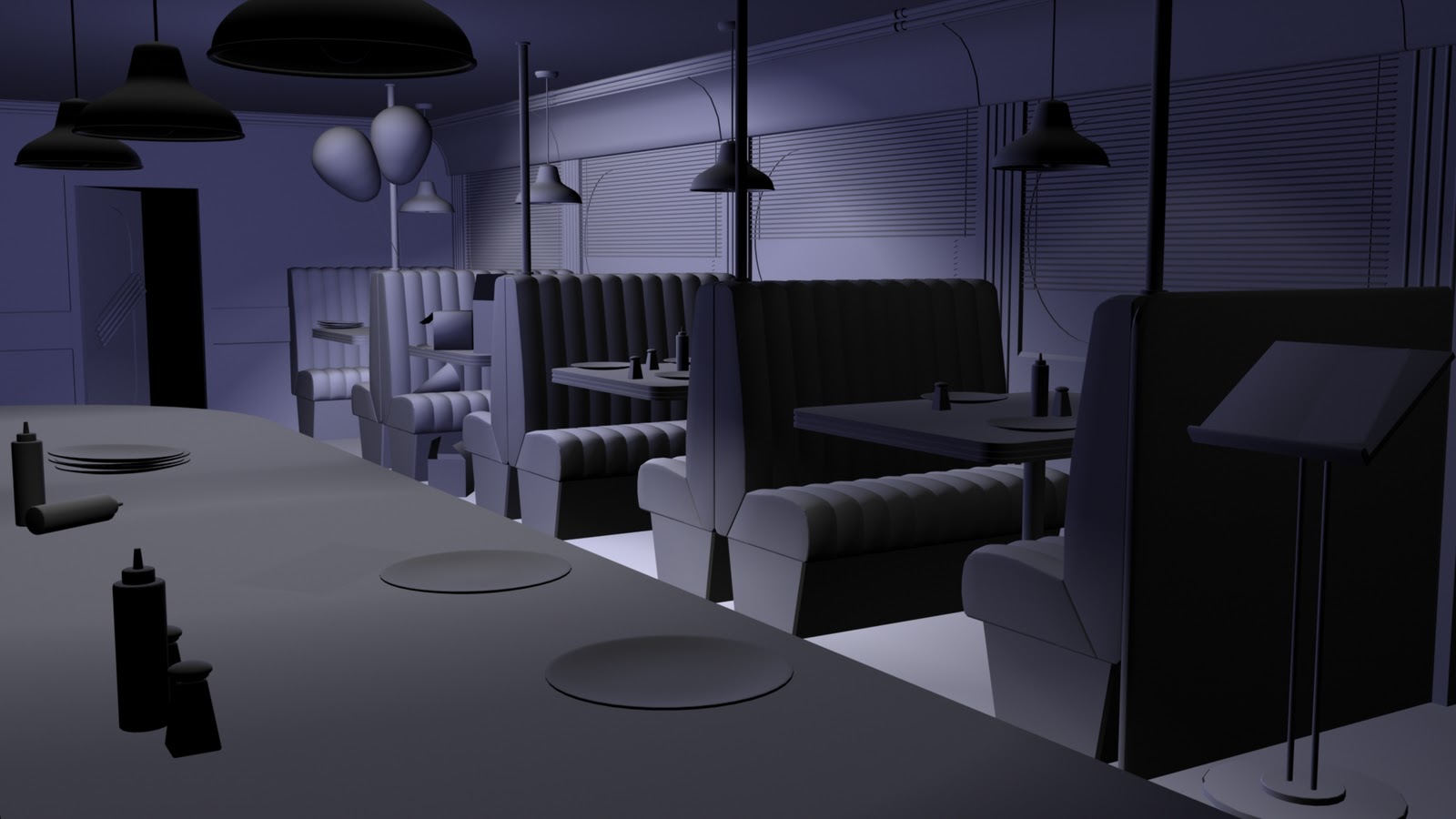


Preparatory Study- Lighting Tests
With the modelling and texturing practically done at this point, I've adjusted the lighting in various different ways in order to see how the lighting impacts the tone of the scene.

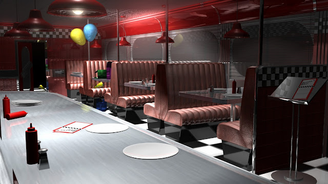


Spotlights Above Tables with No Ambient: This lighting method displays the birthday props clearly whilst providing the scene with a somewhat menacing tone. Although this is quite a dramatic setup, it doesn't personally provide the scene with an uncanny tone.

Spotlights Above Tables with Ambient: This setup brightens the scene, making the frighteningly tacky plastic surfaces all the more obvious. This is a slightly more suitable setup than the previous, although it still seems a little too... expected.

Ambient and Focused Spotlight: This setup has a dimmer ambient light, with a focused spotlight on the birthday props in order to direct attention to that area. Its way too blunt and whilst this is a night setting, it seems out of place that a setting with such vivid fluorescent lighting would be so dim.

Adjusted Focused Spot and Ambient: The focused spotlight has been pulled back from the balloons etc and the ambient light lowered into the centre of the scene. An improvement on the above setup.

Intense Ambient: This lighting setup really sums up the fantastic plastic aesthetic of the diner. This plays really well with the naturally uncanny tone of the scene, although it does mute the brightness of the birthday props somewhat, making them a little redundant in the scene compared to everything else.

Intense Ambient, Ambient Shade Reduced: Same intense ambient settings as above, with the ambient shade setting reduced. This is a little too bright, flattening the image as its drawn most of the notable shadows away.

Intense Ambient, Ambient Shade Increased: Much better setup than the reduced ambient shade. The scene feels a lot more natural and everything is lit in a complimentary way. This is a positive final lighting option.

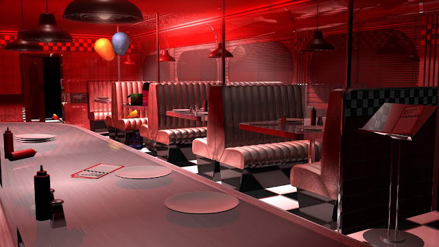
Intense Ambient, Red: Well. This is very... Suspiria. Whilst it provides the scene with a sense of menace, this isn't the tone I wish to achieve, but realising the effect on tone that colour has led me to experiment using colour in more subtle ways.

Intense Ambient, Blue: This lighting setup makes the night time setting incredibly apparent, but it dulls the clean cut aesthetic of the interior. The blue does a good job of drawing attention to the birthday props, though.

Intense Ambient, Lilac: The lilac colour is subtle enough to keep from flattening the scene, whilst still retaining a clinical feel. Another potential final lighting option.

Intense Ambient, Lilac. Focused Spotlight Adjusted: This setup has the same settings as the previous setup, but the spotlight focused upon the birthday props has been adjusted in order to remove the noticeable glare upon the ceiling (seen in all previous renders).
Monday, 16 January 2012
Modelling Update 16/1/12: Experimenting with Lighting
Even though the modelling and texturing process isn't quite finished yet, I played around with lighting what I've already put in place. Whilst working, I've consistently had this bright image in mind, but through experimenting with lighting, my ideas have shifted somewhat.
The following lighting setups are significantly more 'brooding' than my previous renders, and in all honesty, I'd sort of tried to keep away from this approach, as I felt it appeared as if I would be making things deliberately darker in an attempt to squeeze a little more drama out of the scene. After the interesting accident with Maya yesterday, my opinion regarding a darker scene changed, and this led me to try out alternative lighting techniques. These experiments are a pleasant change to what I was striving for initially, and its looking more and more likely I'll be going down this road in order to really push my scene to its limits.


 Just out of curiosity, I took the previous render into Photoshop and desaturated it. Wow. I adore this film noir-like render. I know black and white is yet another method of forcing a particular, brooding sense of drama upon the audience, but it fits unbelievably well with the 1950's setting. It really compliments the reflective sheen of the scene, accentuating each glisten of light across linoleum. Really, really like this image.
The following lighting setups are significantly more 'brooding' than my previous renders, and in all honesty, I'd sort of tried to keep away from this approach, as I felt it appeared as if I would be making things deliberately darker in an attempt to squeeze a little more drama out of the scene. After the interesting accident with Maya yesterday, my opinion regarding a darker scene changed, and this led me to try out alternative lighting techniques. These experiments are a pleasant change to what I was striving for initially, and its looking more and more likely I'll be going down this road in order to really push my scene to its limits.

This render is lit by spotlights alone, drawing the attention towards the tables. I really liked how the light played across the seating, so I used this method in the next render.

This render is similar to the render above, although the spotlights have been dimmed significantly on all but one table, to draw more attention to the birthday setup at the back of the scene (which I have also decided to bring forward a table, simply to create a balance between the diner environment and the props). I also brought more of the colour out of the scene by placing an ambient light high up in the ceiling. Whilst it doesn't light the scene significantly, it brings out the areas of diner which would not be lit by the spotlights alone.

Sunday, 15 January 2012
Submission Disc (And An Interesting Rendering Mishap)


I rendered out this image simply to remind myself where I was in terms of progress, and I was presented with this totally accidental film noir style scene. It totally shifts the tone of the scene and has made my brain fizz with intrigue. I love these sorts of accidents!
Saturday, 14 January 2012
Updating My Ideas, Somewhat
Its been one of those long days at work where I am simply stood in between the beeping of tills, and during those long days I find myself drifting off into 'project mode', where I just think and think and think. During these moments today, I refined an idea surrounding the overall story surrounding my scene that had sort of developed as I was modelling the various components.
It builds upon the birthday idea, but adds somewhat of an implied narrative to the scene, very much influenced by the work of Gregory Crewdson.
The birthday scene was initially going to be placed within the scene to break up the repetition of the diner, whilst now I've began to think about ideas surrounding imperfections found within perfection. The perfection in this case is the clean, clinical presentation of the diner, in a 50's setting which, in almost every visual representation, is an example of a perfect lifestyle. The imperfection lying within this perfection is the idea of a suggested kidnapping.
This will be presented by distressing the birthday scene somewhat, displaying signs of a struggle, with the door at the back of the scene leading out into a car park, with nothing in sight other than a pair of tire tracks and a single party hat. These elements will be matte painted, in a night time setting, and illuminated in the painting by a spot light, possibly from a street lamp or headlights. I may incorporate some blue and red lighting streaming through the shutters of the diner, although this may kill the subtlety of the narrative somewhat, a little bit too 'bloodstain on the carpet'.
Finally, I know this is a little late in the game, but its not so much a totally new idea, but more refining an existing one, so that I can get the most effective and satisfying result from my work.

A Very, Very Loose Thumbnail Depicting my Refined Idea
Modelling Update 14/1/12- Testing Out Some Textures
I had some free time before I had to shoot off to work today, so I quickly created a basic faux leather texture to be used on the seating. I've added a basic bump map, as well as just playing around with the chrome details on the hand rails etc.


Incorporating the Textures in the Scene (I also added an ambient light in the centre of the ceiling)

The Faux Leather Seat Texture

The Seat Bump Map
Friday, 13 January 2012
Modelling Update 13/1/12- Mapping the Bulk of the UVs
Whilst there is still some work to be done, the bulk of the UVs that make up the major components in the scene have been mapped out. I still need to add some more basic models in to dress the scene and make it feel more natural, as well as constructing the 'birthday scenario' elements.


The UVs in Place

The Current Texture Map (I've made a point to only map out the areas that will appear in shot, simply to save myself time texturing. Not a lot of point focusing on areas that are totally unseen).
Thursday, 12 January 2012
Modelling Update 12/1/12- Modelling Almost Complete

I've almost completed the bulk of the modelling (i.e. the seating, tables etc), of course, I won't be duplicating and placing these until I've mapped out the UVs. Still, I've decided to dress the scene a little, with the birthday scene under construction at the back. The prop layout is messy, as opposed to the hyperreal perfection angle I was going for, and this will probably change once I've textured and shifted everything.
Modelling Update 12/1/12

Adding the details to the 'placeholder' models. Hopefully the modelling process will be completed this evening, so that I can map out the UVs during tomorrow's Maya session.
Wednesday, 11 January 2012
Beginning the Modelling Process
Although the concept painting is yet to be completed, I've started to assemble the scene in Maya, as I have enough information to work with currently.
The scene has currently been established with low detail polygons that will be expanded upon. Although I will be creating one of each prop and then duplicating them, I needed to make sure everything was scaled correctly against one another, otherwise I'd spend hours working into a model that just didn't fit.
The matte painting will likely be a street scene through the windows, although I am yet to decide whether it will be a daytime or night time scene. As this will influence the lighting of the scene, I will probably experiment loosely with lighting beforehand, and then create the painting after I find suitable lighting. I'm also wondering about possibly positioning the door at the end of the diner (shown in the concept painting) slightly ajar, which would lead to another potential matte painting opportunity.
The angle I was working at whilst modelling

The camera repositioned to emulate the concept painting more accurately
Concept Artwork Progress- 11/1/12

Just a bit more progress on the concept painting. Still a while to go, but mainly just refinement and finishing up the bar area now.
Tuesday, 10 January 2012
Concept Artwork Progress 10/1/12- Update
I know I only uploaded the initial progress two or three hours ago, but still, heres a bit more progress with some sort of thumbnail sketches within the concept, just ideas which came to mind whilst painting, attempting to determine where they could be placed etc. Once again, its messy, but refinement isn't what I'm going for just yet. I've been treating this painting as somewhat of a testing ground for every little thought that pops into my head, but its looking pretty promising, for whats there.


Concept Artwork Progress 10/1/12

This is the gradual progress of my concept artwork for the diner. Its far from finished, but the basics have been established, such as the seating, bar and main window. This will be added to over the next day or so in order to establish all the minor elements in the scene, but the chances that I will change my mind in terms of object design etc when I get to Maya are pretty high.
Monday, 9 January 2012
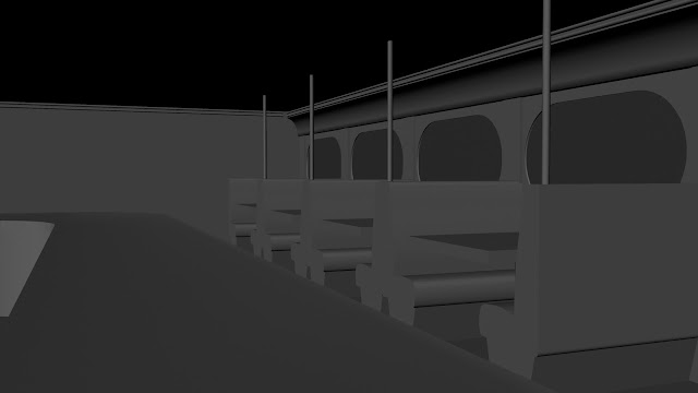
Experimenting with Composition in Maya
I've been struggling lately in terms of shot composition, no matter how many thumbnails that I create, the same shot layout appears in each one. I decided to just hop into Maya and see what I could do with a few basic primitives representing the major elements of my scene, notably, the booth style seating and the bar, as well as the walls, floor and ceiling. These are deliberately basic shapes, simply put in place to give me an idea of space and scale.
I intend to include various other props to the scene, as well as adding windows to the far and right walls. I've omitted them from this exercise for the moment, as the real focus is on the major shapes in the scene and not on the minor elements, which are likely to simply be added and moved to my liking later on in the development process.


I intend to include various other props to the scene, as well as adding windows to the far and right walls. I've omitted them from this exercise for the moment, as the real focus is on the major shapes in the scene and not on the minor elements, which are likely to simply be added and moved to my liking later on in the development process.
The camera is pulled pretty far out of the centre of the scene, exposing the door on the right, with the bar on the left. This leaves a lot of empty space in the centre of the scene, and frankly, isn't an overly exciting shot. Way too open.

The camera has been pushed in a little closer to the centre of the shot, although the bar on the left is dwarfed somewhat by the booths on the right.

The bar has been brought out and is now more prominent in the scene, but the open space is still an issue for me.

The left wall and the bar have been brought inwards, tightening up the space a little and already making the scene a little busier. It also gives a interesting view of the bar, with the view stretching out into the distance, whilst simultaneous heading into the foreground. This opens up some good opportunities for some interesting foreground elements on the bar.

The camera has been pulled back to expose the door once more. The open space outside of the door is a potential matte painting opportunity, if I was to go with this shot.

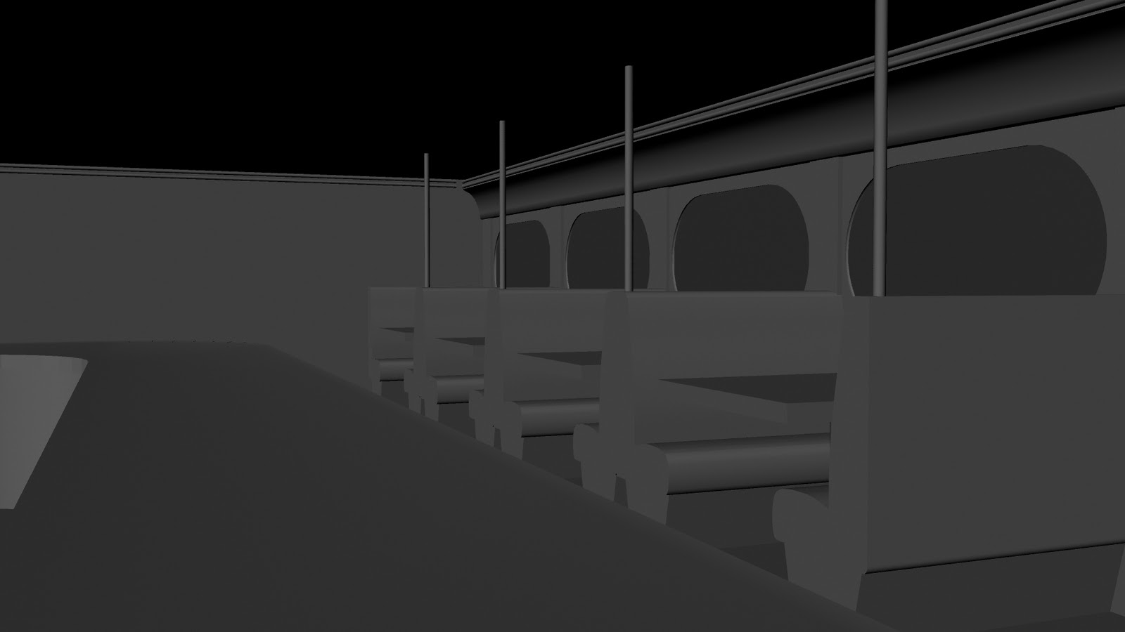
The camera is situated behind the bar, providing a clear, almost panoramic shot of the booths, as well as a sweeping view of the bar area. This is the most dynamic shot up to this point, in my opinion.

An alternative to the previous composition, lifting the camera up and above the bar more so, and framing the booths as to direct focus to that area.

The camera has been moved to the other side of the diner. The booth in the foreground is a really interesting element, and if I were to go forward with the 'Birthday' idea, this would be a great point in which to display the items.
Saturday, 7 January 2012
Scene Development Update 7/1/2011
Over the holiday season I've dedicated a considerable amount of time to simply... thinking. The most blatant problem I'm having is the composition of the scene. In attempting to retain the iconic appearance of the Americana-style diner, I end up with a scene that, whilst filled with interesting items and objects, is dull in its layout.
Although this linear layout fits my idea of 'the uncanny through repetition' effectively, its one thing to have an effective theme, and another entirely to have an effective image.
As a result of this, I've moved back to an older idea that still retains the uncanny element of the repetition, but in an alternative way. This new idea involves breaking the repetition in some way. I aim do this by adding comfort to viewer through the repetition, only to take it away by halting the repetition with something plausible, but still likely in the setting.
I've attempted this by adding the idea of a birthday scenario within the diner. Its something that is entirely likely to occur, and yet it is significant enough to break the repetition of the scene.
Of course, the uncanny element of the scene could be totally ruined by the obvious nature of the birthday set up in the diner, so I may attempt something a little more subtle, such as taking existing elements within the scene and making them somewhat askew, interrupting the repetition somewhat as opposed to completely cutting it off.


The elements of repetition in the scene are primarily the seating, tiles on the floor, walls and ceiling and objects such as bottles, menus, cutlery and crockery. When laid out in a strategic fashion, the uncanny tone is at its highest. This could be nudged a little higher by throwing a visual spanner in the works to upset the pattern, although subtlety is what will make this method effective.


Although this linear layout fits my idea of 'the uncanny through repetition' effectively, its one thing to have an effective theme, and another entirely to have an effective image.
As a result of this, I've moved back to an older idea that still retains the uncanny element of the repetition, but in an alternative way. This new idea involves breaking the repetition in some way. I aim do this by adding comfort to viewer through the repetition, only to take it away by halting the repetition with something plausible, but still likely in the setting.
I've attempted this by adding the idea of a birthday scenario within the diner. Its something that is entirely likely to occur, and yet it is significant enough to break the repetition of the scene.

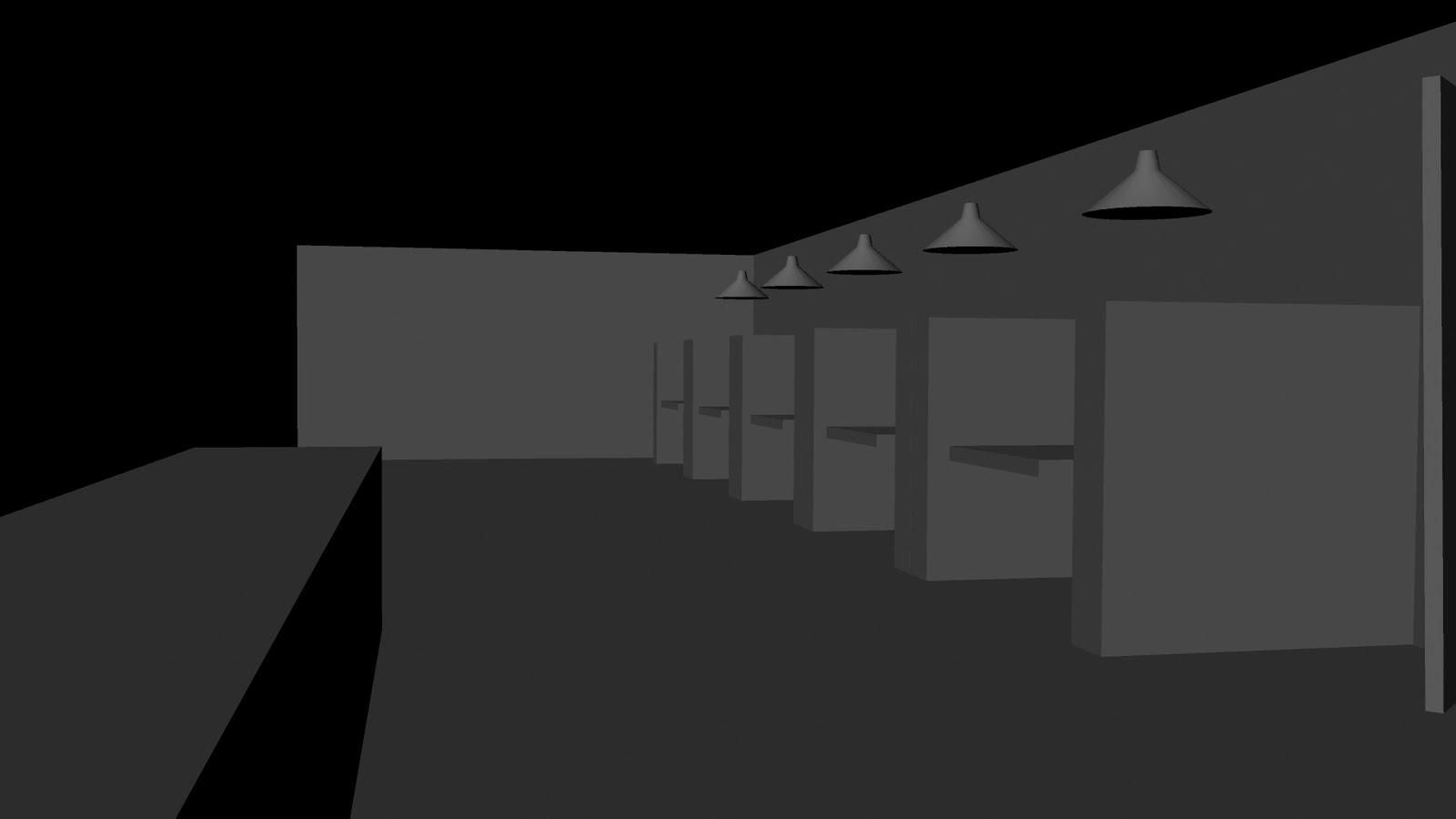
How I started out, focusing a little too much on the bar area, simply for its aesthetic qualities. Whilst the bar itself isn't uncanny, it is a good (whilst a little cliche) point of focus in the scene, and could be used for this purpose effectively.


The birthday party idea was something that came to mind early on in the project, but I dismissed it as initially I didn't want a central point of focus within the scene. Although, when I developed my ideas a little further, I decided to revisit it, as it may have a purpose paired with my more recent thoughts.

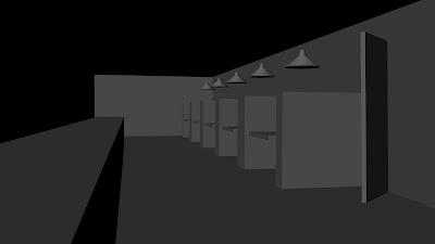
Just a quick thumbnail depicting the contents of the table. Typical birthday stuff.

A quick thumbnail with the birthday scene place loosely at the back of the diner. This 'dropped in' approach is pretty much the opposite of what I want from the scene. It sticks out way too much, but then again, it probably would anywhere in the room. This is leading me to pursue a more subtle approach, something less 'in-your-face'.

A small diagram depicting the placement of the scenario within the repeated elements of the diner. About as blunt as a can be when demonstrating my idea.
Subscribe to:
Posts (Atom)