
Spotlights Above Tables with No Ambient: This lighting method displays the birthday props clearly whilst providing the scene with a somewhat menacing tone. Although this is quite a dramatic setup, it doesn't personally provide the scene with an uncanny tone.

Spotlights Above Tables with Ambient: This setup brightens the scene, making the frighteningly tacky plastic surfaces all the more obvious. This is a slightly more suitable setup than the previous, although it still seems a little too... expected.

Ambient and Focused Spotlight: This setup has a dimmer ambient light, with a focused spotlight on the birthday props in order to direct attention to that area. Its way too blunt and whilst this is a night setting, it seems out of place that a setting with such vivid fluorescent lighting would be so dim.

Adjusted Focused Spot and Ambient: The focused spotlight has been pulled back from the balloons etc and the ambient light lowered into the centre of the scene. An improvement on the above setup.

Intense Ambient: This lighting setup really sums up the fantastic plastic aesthetic of the diner. This plays really well with the naturally uncanny tone of the scene, although it does mute the brightness of the birthday props somewhat, making them a little redundant in the scene compared to everything else.

Intense Ambient, Ambient Shade Reduced: Same intense ambient settings as above, with the ambient shade setting reduced. This is a little too bright, flattening the image as its drawn most of the notable shadows away.

Intense Ambient, Ambient Shade Increased: Much better setup than the reduced ambient shade. The scene feels a lot more natural and everything is lit in a complimentary way. This is a positive final lighting option.
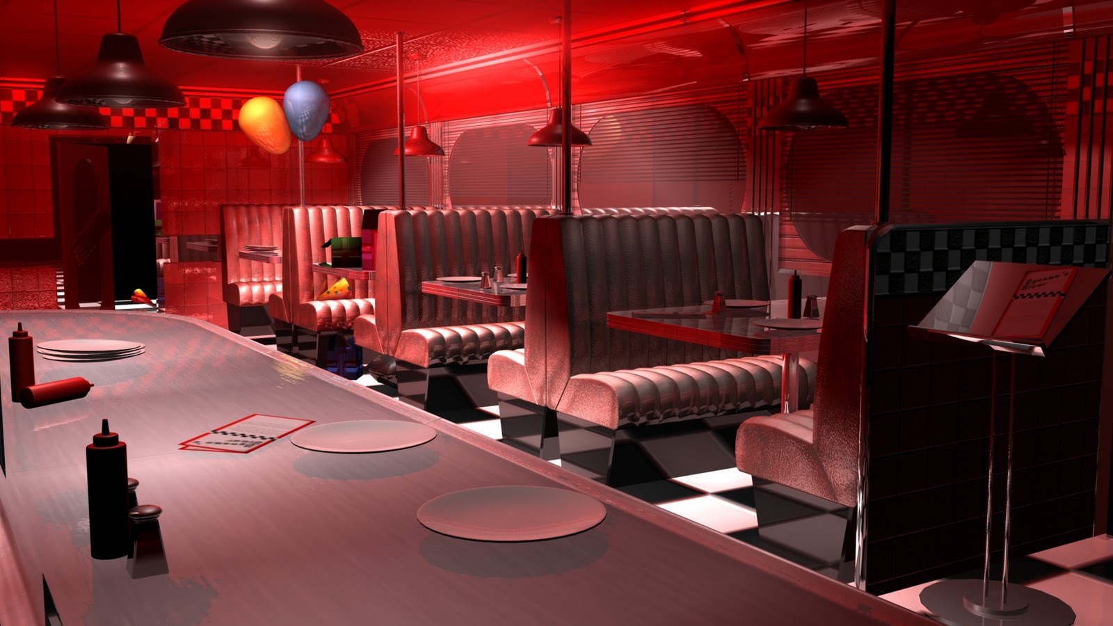
Intense Ambient, Red: Well. This is very... Suspiria. Whilst it provides the scene with a sense of menace, this isn't the tone I wish to achieve, but realising the effect on tone that colour has led me to experiment using colour in more subtle ways.

Intense Ambient, Blue: This lighting setup makes the night time setting incredibly apparent, but it dulls the clean cut aesthetic of the interior. The blue does a good job of drawing attention to the birthday props, though.

Intense Ambient, Lilac: The lilac colour is subtle enough to keep from flattening the scene, whilst still retaining a clinical feel. Another potential final lighting option.

Intense Ambient, Lilac. Focused Spotlight Adjusted: This setup has the same settings as the previous setup, but the spotlight focused upon the birthday props has been adjusted in order to remove the noticeable glare upon the ceiling (seen in all previous renders).
Hi Steven I know this is probably a little late. The scenes looking great but I would just go in and deshine the bases of the seats a smidge they are a bit too CG shiny rather than clinical shiny at the moment especially with the checker floor.
ReplyDeleteStill looking good though.
Simon
Just a though, have you tried rendering a Z-depth pass to see if some depth of field might make it pop just that little bit more?
ReplyDeletehey steven scene is looking good dude. just little bit of what simon picked up on already the scene looks a bit too cg i think thats because of the shine. but other then that good job dude :D
ReplyDelete