Showing posts with label Unit Two. Show all posts
Showing posts with label Unit Two. Show all posts
Thursday, 24 November 2011
Tuesday, 22 November 2011
@Phil- Written Assignment So Far
I just wanted to put the early progress of my written assignment up just to make sure I'm on the right track before I go any further.
Introduction
Introduction
This assignment will be looking at Robert Zemeckis’ Back to the Future: Part II, in particular, the portrayal of the town of Hill Valley in the years 1985, 1955 and 2015, as well as the alternate 1985. This includes investigating production processes, the use of product placement to create a more immersive and relatable world, and the advances in filmmaking spurred on by the film, such as digital shot compositing.
Sources to be used for this assignment include the film itself, the interview of Michael J. Fox from Inside the Actor’s Studio to gain a more personal recollection of the filmmaking experience and the ‘behind-the-scenes’ featurette found on the BttFII DVD, for a first hand perspective on the filmmaking process. Other sources include the book Digital Filmmaking: The Changing Art and Craft of Making Motion Pictures by Thomas A. Ohanian and Michael E. Philips for information regarding the process of digital shot compositing and an article on product placement titled How Product Placement Works.
Main Body
The key story element in the Back to the Future series is time travel, providing the opportunity to go anywhere, at any time. The film uses the H.G. Wells rules of time travel, meaning that the characters are able to travel through time, but not space. The fact that the films are somewhat limited to one location (with the Delorean only being able to travel through time, and not space) meant that Zemeckis and his team had to reinterpret the town of Hill Valley in three entirely different time periods, not to mention the alternate 1985.
In the original Back to the Future, the set for 1950’s Hill Valley was constructed initially and the 1950’s scenes were shot first. The production team then weathered the set to appear worn over time, so that the town would appear convincingly aged by 1985. In the sequel the team had to meticulously recreate scenes from the original film, as well as creating a futuristic envision of Hill Valley in 2015. This task was assigned to production designer Rick Carter and his team. Carter comments on his initial thoughts for the future Hill Valley, saying,
“We had to, in a sense, get everybody to get past the images that came from Bladerunner, you know? Smoke and the chrome and everything, and I just felt that it was important that we be as detailed as they were, but that we convey a different tone” (Rick Carter, 1989)
The production team strived to portray a believable future that retained the humorous tone of the previous film, as well as retaining the essence of Hill Valley at all times. This was achieved mainly by modifying the original set, as well as making some set pieces visual landmarks, constantly reminding the audience of their location. For example, throughout each time period the clock tower in Courthouse Square helps the audience to differentiate between time travel and simply moving to another location. Its familiar construction remains the same throughout each interpretation of Hill Valley, reinforcing the fact that the characters haven’t simply moved, but the world around them has changed itself over time.
The tone of the 2015 Hill Valley is somewhat of a parody of modern day consumerism, poking fun at what is now typical of modern society. The film picks up on the idea of extreme convenience, creating a world where lifting a finger could be considered a chore.
“There's also quite a strong undercurrent of bleakness. The shopping mall Consumerville of 2015 — all video screens, holograms and a middle-aged Marty being fired by his Japanese boss — is hardly enviable for all its hi-tech trimmings” (Tunney, 2008)
Monday, 21 November 2011
'The Masque of the Red Death' Progress
This is the initial progress on my image for 'The Masque of the Red Death'. I've carried over the style of illustration and lighting from 'The Shunned House' and so far, it's looking quite interesting. Its far from complete, but as a starting point, this isn't too bad.
Sunday, 20 November 2011
Colours of 'The Masque of the Red Death'
Just a quick update concerning the colour palette for 'The Masque of the Red Death' I will be using, created using TheColorOf.com.
I've established the swatches but Photoshop is being a little moody at the moment, so I can't put them together and upload them. Never the less, here are the images I took colours from.
'The Shunned House': Playing with Levels
This image is more or less the original with the colours amplified moderately. I like the vibrancy of this image, especially the light falling across the rooftops of the houses on the right.
This image shows the green levels more prominently. I really like the tone displayed in this image. It retains the original boldness but shifts the tone entirely.
The levels in this image make the reds and blues more vibrant, applying a somewhat sinister tone overall. As effective as this image may be, its a bit too 'loud', even with an image as bold as the original. The clear separation of the white fence posts and the rest of the scene work brilliantly, though. Very 'Monkey Island'.
This image is similar to the image above, but with the greens made a little more vivid and the blues a little more suppressed.
I decided out of pure curiosity to see how it looked in simple black and white (with a blue filter) and I'm pleasantly surprised. I seems to address the tone perfectly. The lonesome, yet endearing house on the hill, the lighting during the focus to the house in the centre, with the light rolling across the tree limbs. I love it!
'The Shunned House' Progress
Just a little progress on the image from when I returned from work this evening. I've played around with lighting the scene (quite obscurely) using the red sky as my light source. I think it plays to the existing vivid colour palette well and kind of makes the scene that little bit more lively. I need to figure out a way of making the light pouring from the basement seem more like light and less like a beige pavement. There are many small details yet to be added and many things to be altered, but overall I feel the image is coming together nicely.
Saturday, 19 November 2011
'The Shunned House' Progress
Just a quick bit of work to the image before I head off to work. It seems to be coming together nicely now and I think for the first time this unit, I'm genuinely quite happy with the progress of this piece. hurrah! Of course, there is so much more to be done to it, but the house is already starting to take shape rather nicely, so hopefully this may be finished by around midnight on sunday (I really, really hope so!).
Friday, 18 November 2011
Thursday, 17 November 2011
Wednesday, 16 November 2011
Thumbnails and Experimenting with... Stuff for The Shunned House
"Stuff"? Yep, stuff. Not too sure how I can categorise a lot of this, as its all a bit muddled up bits from testing colours, to methods of illustrating, to composition. I'll explain as I go along.
Fig One- This was a quick experiment with one of the colour palettes I put together. I didn't dwell on detail, simply how colours would react with one another. I quite like the obscure partnership of colours and I'll probably carry these through to my final image.
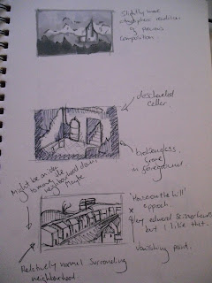
Fig Two- In this thumbnail I played around with using symmetry to construct the building more accurately. I love how this turned out, both structurally and tonally, but unless the building is head on, this method doesn't really work so well.
Fig Three- In this thumbnail, I attempted to block out shapes with blobs of value instead of using line. I've tried this technique countless amounts of times, but I find it incredibly difficult to visualise my scene this way. I will incorporate this technique in some way (to suggest a distant landscape, for example) but I'll be using line to fabricate my final image, simply because I feel I have more control that way.
Fig Four- This was a very quick thumbnail just establishing potential foreground elements and general composition. This idea was carried over to the next image.
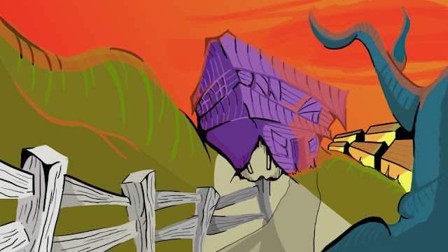
Fig Five- This is probably going to be my final painting for The Shunned House as it is the first idea I've had that I genuinely believe could translate into a pretty impressive image. The warped structure works well with the content of the story, as well as reflecting my own, slightly askew drawing style. There are some elements that I will reconsider adding in the final image (such as the gravestones, the high hill area behind the house etc), but in terms of style and composition, I am very happy with this idea.
I've got to find the rest of my thumbnails for The Masque of the Red Death and The Shunned House, which I shall hopefully upload tomorrow, along with the progress of my Maya work.
Sunday, 13 November 2011
Saturday, 12 November 2011
Colours of 'The Shunned House'
Using the 'Colour Of' website suggested by Phil, I've began putting together some colour palettes for my images. Starting with 'The Shunned House', I began by jotting down words that I associated with the story as soon as they appeared in my head. I then entered these words into TheColourOf.com and saved the resulting images.
I then took the recurring hues of pink, purple, green, blue and orange and made swatches from them using ColourSchemeDesigner.com (another 'Phil-suggested' site), so that I could later incorporate them in my images.
I then took the recurring hues of pink, purple, green, blue and orange and made swatches from them using ColourSchemeDesigner.com (another 'Phil-suggested' site), so that I could later incorporate them in my images.
The first three colour palettes are tetradic colour schemes, the fourth is triadic and the fifth is complimentary.
The colours are very vibrant, which reflects my own personal preference and style of using bold colours in contrast with dark, black tonal work to develop somewhat of a visual harmony. This is a very 'comic book' approach, and is probably the most familiar to myself, but it may not be suitable for concept paintings.
This is where I need some help. Do I sacrifice personal style choices in order to create, what I feel may be a slightly more generic, less interesting image, or do I work in a more comfortable way, developing the image how I envision it in my head with my own stylistic preferences, but risk coming out with (in the words of 'Photoshop' Phil) a more 'childish' image?
Please, give me advice! I'm a little stuck here! Thank you!
Subscribe to:
Posts (Atom)


