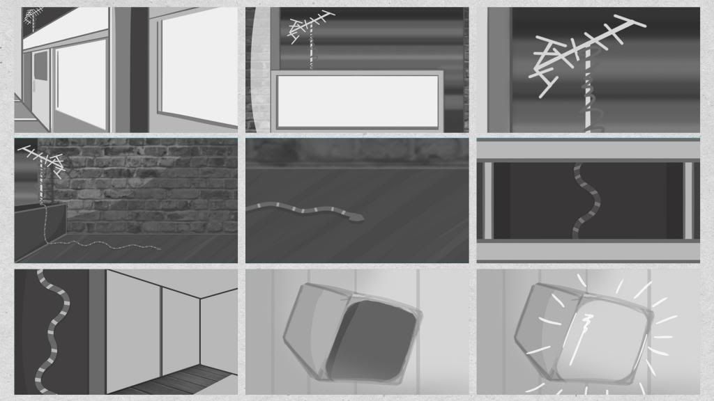
Tidy-Heidi Logo Ideas
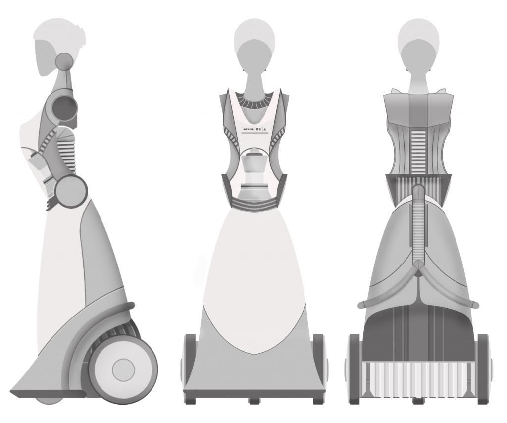
Being that the two characters are appliances, I've began to brand them accordingly, starting with Tidy-Heidi. I plan on creating a logo for both characters, as well as two Hygieneotech logos, one older logo to fit with period in which the older robot was manufactured, and a more modern one, fitting with Tidy-Heidi's era.
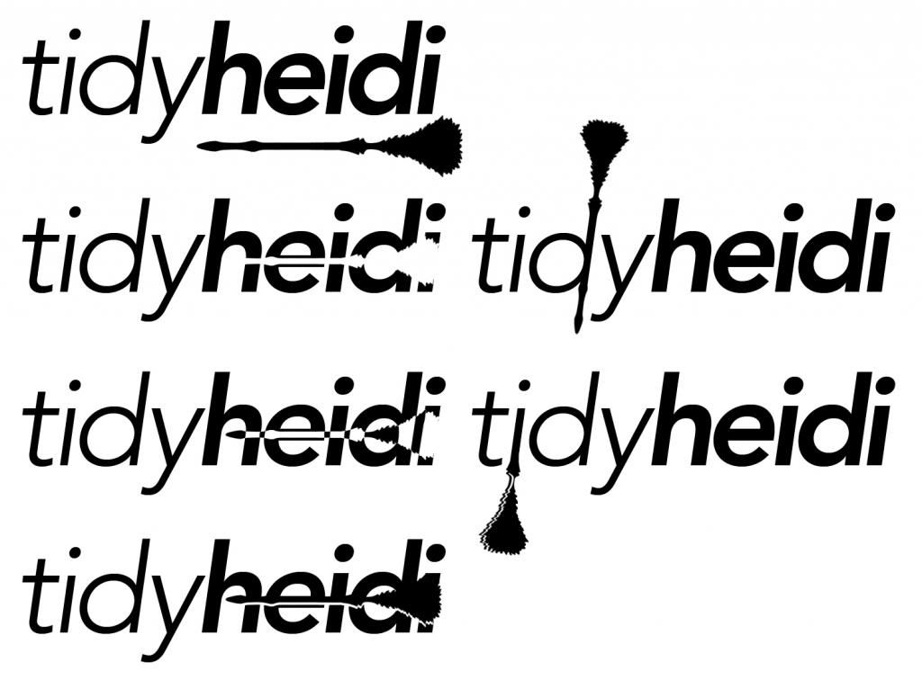
I began by determining a suitable font, literally searching through Font Book for about an hour. I whittled down a wide selection to just one font; Avenir. I spent a while toying with combinations of capitalisation, letter weight, spacing and italicisation until I settled on something that seemed to fit the character. I didn't particularly want to just leave it as text alone, so I incorporated a quick illustration of a traditional feather duster to add some character to the logo. I first used it to underline the logo, but then I tried variations of the combination, setting it within the text, highlighting the edges and others. My favoured logo is in the top right, showing the feather duster as the neck and tail of the first lower case 'd'.
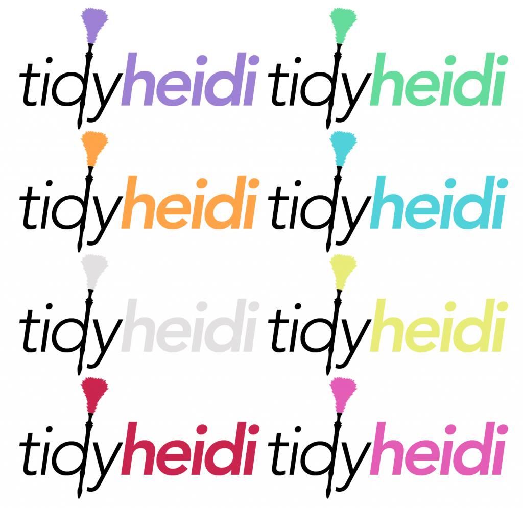
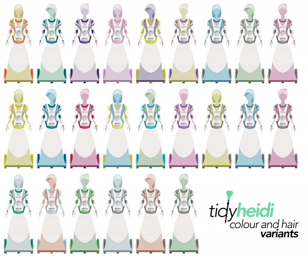
I took my favoured logo and made some quick colour tests, highlighting the 'heidi' and feather elements of the logo. The colour combination would likely reference that of the character herself, so this was also a method of establishing a bit of a jumping off point for her overall colour scheme. I'm fond of several of these tests, with the exception of the pink and grey variations. I'll determine a final colour scheme for the logo when I've decided on what suits the character best overall.