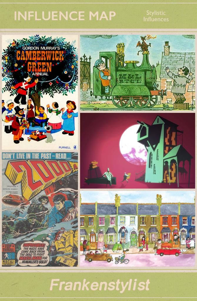
Here is a small collection of my revised stylistic influences. The samples below are a combination of period relevant aspects of popular culture and other things I found visually striking.
In the top left, I've got
Camberwick Green, chosen for the simple use of block colour and basic geometric shapes making up the characters.
Next to that is
Ivor the Engine, chosen for its use of washed out, painterly textures.
In the centre is a screenshot from iOS game
Lumo Deliveries, chosen for the striking cel-shaded lighting, contrasting yet complimentary colour palette and bold, off kilter environment design.
Underneath that is a frame from
Mr Benn, chosen again for the rendering of washed out textures, as well as the uniform, yet subtly disorderly appearance of the buildings, thanks to the use of loose, hand drawn line art.
Finally, in the bottom left, is a cover from an issue
2000AD, chosen for the eye-popping realistic, yet stylised character design. Using traditional human characters, with exaggerated expressions and vivid colour palettes, it gives it a very
Argento feel.
Overall, I want my animation to have a fairly realistic feel in regards to the character and environment design, but with exaggerated use of colour and lighting to help provide an unsettling atmosphere.

