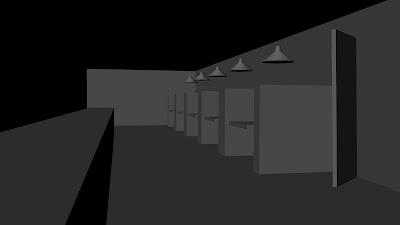
I intend to include various other props to the scene, as well as adding windows to the far and right walls. I've omitted them from this exercise for the moment, as the real focus is on the major shapes in the scene and not on the minor elements, which are likely to simply be added and moved to my liking later on in the development process.
The camera is pulled pretty far out of the centre of the scene, exposing the door on the right, with the bar on the left. This leaves a lot of empty space in the centre of the scene, and frankly, isn't an overly exciting shot. Way too open.
The camera has been pushed in a little closer to the centre of the shot, although the bar on the left is dwarfed somewhat by the booths on the right.
The bar has been brought out and is now more prominent in the scene, but the open space is still an issue for me.
The left wall and the bar have been brought inwards, tightening up the space a little and already making the scene a little busier. It also gives a interesting view of the bar, with the view stretching out into the distance, whilst simultaneous heading into the foreground. This opens up some good opportunities for some interesting foreground elements on the bar.
The camera has been pulled back to expose the door once more. The open space outside of the door is a potential matte painting opportunity, if I was to go with this shot.
The camera is situated behind the bar, providing a clear, almost panoramic shot of the booths, as well as a sweeping view of the bar area. This is the most dynamic shot up to this point, in my opinion.
An alternative to the previous composition, lifting the camera up and above the bar more so, and framing the booths as to direct focus to that area.
The camera has been moved to the other side of the diner. The booth in the foreground is a really interesting element, and if I were to go forward with the 'Birthday' idea, this would be a great point in which to display the items.


No comments:
Post a Comment