Showing posts with label Thumbnails. Show all posts

Wednesday, 16 November 2011

Thumbnails and Experimenting with... Stuff for The Shunned House

"Stuff"? Yep, stuff. Not too sure how I can categorise a lot of this, as its all a bit muddled up bits from testing colours, to methods of illustrating, to composition. I'll explain as I go along.


Fig One- This was a quick experiment with one of the colour palettes I put together. I didn't dwell on detail, simply how colours would react with one another. I quite like the obscure partnership of colours and I'll probably carry these through to my final image.

Fig Two- In this thumbnail I played around with using symmetry to construct the building more accurately. I love how this turned out, both structurally and tonally, but unless the building is head on, this method doesn't really work so well.

Fig Three- In this thumbnail, I attempted to block out shapes with blobs of value instead of using line. I've tried this technique countless amounts of times, but I find it incredibly difficult to visualise my scene this way. I will incorporate this technique in some way (to suggest a distant landscape, for example) but I'll be using line to fabricate my final image, simply because I feel I have more control that way.

Fig Four- This was a very quick thumbnail just establishing potential foreground elements and general composition. This idea was carried over to the next image.

Fig Five- This is probably going to be my final painting for The Shunned House as it is the first idea I've had that I genuinely believe could translate into a pretty impressive image. The warped structure works well with the content of the story, as well as reflecting my own, slightly askew drawing style. There are some elements that I will reconsider adding in the final image (such as the gravestones, the high hill area behind the house etc), but in terms of style and composition, I am very happy with this idea.


I've got to find the rest of my thumbnails for The Masque of the Red Death and The Shunned House, which I shall hopefully upload tomorrow, along with the progress of my Maya work. 

Friday, 4 November 2011

Tiny, Miniscule Update to the Major Thumbnail for 'The Masque of the Red Death'


I wanted to add a bit of the narrative to the image, so that it isn't just a corridor with no real reason for being there, so I've added nods to the climax of the story, where the hooded figure is being pursued from room to room by the Prince and the nobles. The masquerade mask in the foreground adds a little depth as well as providing a nice bit of narrative to the image. As for the cloak, I don't want the figure in full display, as the painting is about the scenery and tone projected, and not the figure, so I felt the cloak dragging around the corner would solve both this problems for me. Of course, it's not finished, and the idea will undergo various revisions, for example, I may add spots of blood being dragged behind the cloak, being that the cloak is somewhat splattered with blood in the story.

Progress on a Major Thumbnail for 'The Masque of the Red Death'

This is a major thumbnail for 'The Masque of the Red Death'. I call it a major thumbnail, as it is essentially an idea in a very early state, but it has the potential to become a final painting.
I've used basic, flat tones to establish a basic idea of the general depth of the corridor, and use of perspective has been used extensively. I'm quite happy with this image, even in this incomplete form, as the development process was a nice combination of my own meticulous, technical approach, with a fluid, freeform approach on top to emphasise and develop the details.

Thursday, 3 November 2011

Playing Around with Perspective

This is what started out as an attempt to develop a thumbnail into a slightly more developed illustration. It's incomplete, as although it was coming along nicely, the incredibly strict construction was too time consuming and it probably wouldn't be a suitable method of creating an entire painting. I added a basic monochrome colour scheme using flat greys, simply to add a little more depth, although I like this approach, and it may find its way in one way or another into my final pieces.

Monday, 31 October 2011

A Few More Thumbnails


Trying out composition and lending somewhat of a personality to the house in 'The Shunned House'


Similar composition as above, using silhouettes of the characters in the foreground to evoke a feeling of adventure and to frame the house for a more impressive presentation


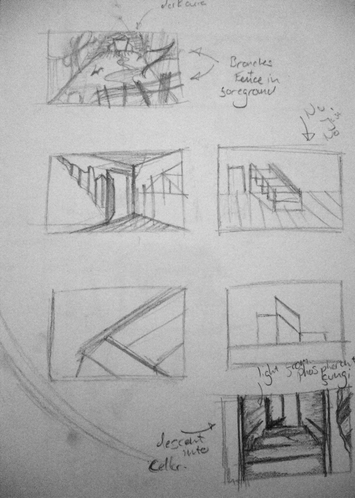
Trying out compositions for the interior, such as descending the stairs into the basement, with the phosphorant light from the fungi pouring under the door. Also playing around with foreground elements in the exterior, using fences etc to draw the viewer in.


Some more ideas for 'The Shunned House' as well as a corridor idea for 'The Masque of the Red Death'. The walls are set deliberately askew in the Georgian palace in order to reflect the Prince's love of the bizarre.


Yet again, more thoughts on the exterior composition for 'The Shunned House'


Ideas for the loose style of the 'stupendous structure built apparently from green jade' from 'The House on the Borderland'. In the story, the structure is near enough identical to the house of the narrator, but from an aesthetic perspective, this seems somewhat silly. I've instead taken elements from the narrator's home (taken from a loose description early on in the book, "This house, how ancient it is! though its age strikes one less, perhaps, than the quaintness of its structure, which is curious and fantastic to the last degree. Little curved towers and pinnacles, with outlines suggestive of leaping flames, predominate; while the body of the building is in the form of a circle") and applied them to a more grand, spectacular construction, to reflect the awe-inspiring location in which it resides.

Thursday, 27 October 2011

Thumbnail Sketches of Initial Ideas

These are the immediate ideas that formed upon a simple reading of the source texts. I've included the mind maps for 'The Shunned House' and 'The House on the Borderland', as well as basic sketches for a typical shot composition for all three source texts, generally following the rule of thirds (studying photography for five years has come in useful after all!)
These are very basic ideas and I like to think my final images will be but an echo of these layouts, although I am quite fond of my corridor layout for 'The Masque of the Red Death' and the gloomy close-up of 'The Shunned House'.


Shot Compositions for 'The Shunned House'


Shot Compositions for 'The House on the Borderland'


Rough Idea of the Presentation of 'The Shunned House' (showing the exposed cellar and general degradation)


Corridor Ideas for 'The Masque of the Red Death' (following the unusual layout of doors put forward in the source text)