Sunday, 20 November 2011
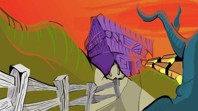
'The Shunned House' Progress
Just a little progress on the image from when I returned from work this evening. I've played around with lighting the scene (quite obscurely) using the red sky as my light source. I think it plays to the existing vivid colour palette well and kind of makes the scene that little bit more lively. I need to figure out a way of making the light pouring from the basement seem more like light and less like a beige pavement. There are many small details yet to be added and many things to be altered, but overall I feel the image is coming together nicely.
Subscribe to:
Post Comments (Atom)


onwards, Steven - though the beige 'triangle' (which I think is a view down into the cellar?) is very distracting now. I think you should consider bring some darkness to the scene - tinkering with the levels etc. Don't misunderstand me - I'm liking the boldness a lot, but get some atmosphere in here too - make is dusk with a capital 'D'.
ReplyDelete