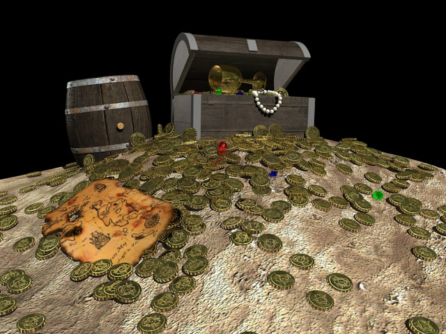
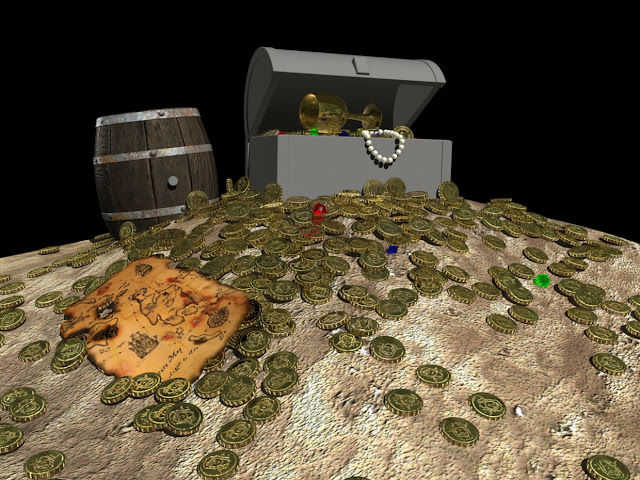
Merry Christmas!
Friday, 16 December 2011
Tuesday, 13 December 2011
Texturing One: Introduction to Shading Networks
Double Sided Shader
Facing Ratio Shader One
Facing Ratio Shader Two
(Altered Transparency)
Facing Ratio Shader Three
(Added Glow)
Monday, 12 December 2011
Saturday, 10 December 2011
Just a Little Blip: Stan Lee, Todd McFarlane and Rob Liefeld Create a Character in Twenty Minutes
Browsing io9.com this evening, I found these great videos of comic book legends Stan Lee (Spider-Man), Todd McFarlane (Spawn) and Rob Liefeld (X-Force) creating a totally original comic book character in about twenty minutes. McFarlane and Liefeld are in charge of designing the character, whilst Lee attempts to justify every minute detail and reinforce the back story.
They're pretty much just throwing the character together spontaneously, resulting in something pretty amazing for twenty minutes work. Goes to show that spontaneity can lead to great results!
(I think I'm having a little trouble posting on the group blog, as this post didn't work on there either. Probably something cookies related or whatever. Either way, there's always room for this stuff on my own blog anyways!)
Original post can be found here at io9.com
Friday, 9 December 2011
Photoshop Texture Exercises: Creating Textures from Photographs
This is the texture I created in todays Photoshop workshop. I attempted to create a backlit sign, like the menus found in restaurants and poster signs outside of the cinema.
The texture was created simply by creating basic shapes, manipulating them and applying photographs as overlays to make it appear more lifelike.
I started with a basic grey rectangle, then applied some smaller, light rectangles in the centre to emulate lightbulbs. I then applied an outer glow to these shapes, and a gaussian blur to soften the shape. A plain white overlay was applied on top of this, acting as the plastic/frosted glass, and the metal frame was constructed by using an inner stroke on the base rectangle, then adding bevels, inner and drop shadows to give it a little shape. Finally, the texture overlay was applied and the layer set to multiply to give it a worn appearance.
I aim to add some text to the texture when I can, just to make its purpose clear (it kind of looks like a grill thing at the moment)
The Texturing Construction Process
The Texture So Far
Testing the Texture as a Series
Thursday, 8 December 2011
Texturing One: Intro to Texturing- Part Eight
The texture, bump map and specular roll off have been added to the metal parts of the chest. Now all that needs to be added is the backdrop and I'm done!
Texture Only
Texture and Bump Map
Texture, Bump Map and Specular Roll Off
Texturing One: Intro to Texturing- Part Seven
The wooden texture has been added to the chest, along with the bump map and specular roll off, now for the metal bits!
Texture Only
Texture and Bump Map
Texture, Bump Map and Specular Roll Off
Wednesday, 7 December 2011
Monday, 5 December 2011
Sunday, 4 December 2011
Friday, 2 December 2011
Texturing One: Intro to Texturing- Part Two
I've added the texture and bump map to the coins, creating a custom bump map in place of the simple letters.
I figured I'd have a little fun with it.
Thursday, 1 December 2011
Life Drawing 29/11/11
This weeks life drawing was pretty successful in terms of loosening up. We were focusing on using areas of tone and value to create our drawings, so I forced myself to focus on these areas by keeping my glasses off for the entire session. It really works! Thanks to my naturally, insanely blurred vision, I couldn't help but see blobs of tone. As for loosening up, I just scribbled and scribbled and scribbled. I was way more relaxed than usual, and I didn't really care if it was misshapen or out of proportion because the creative mayhem was good fun. Hopefully this less uptight approach will find its way into my typical working process and I can get on the way to creating something genuinely interesting!
Subscribe to:
Posts (Atom)


